
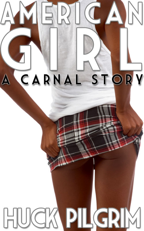
I’m trying out my idea for new covers.
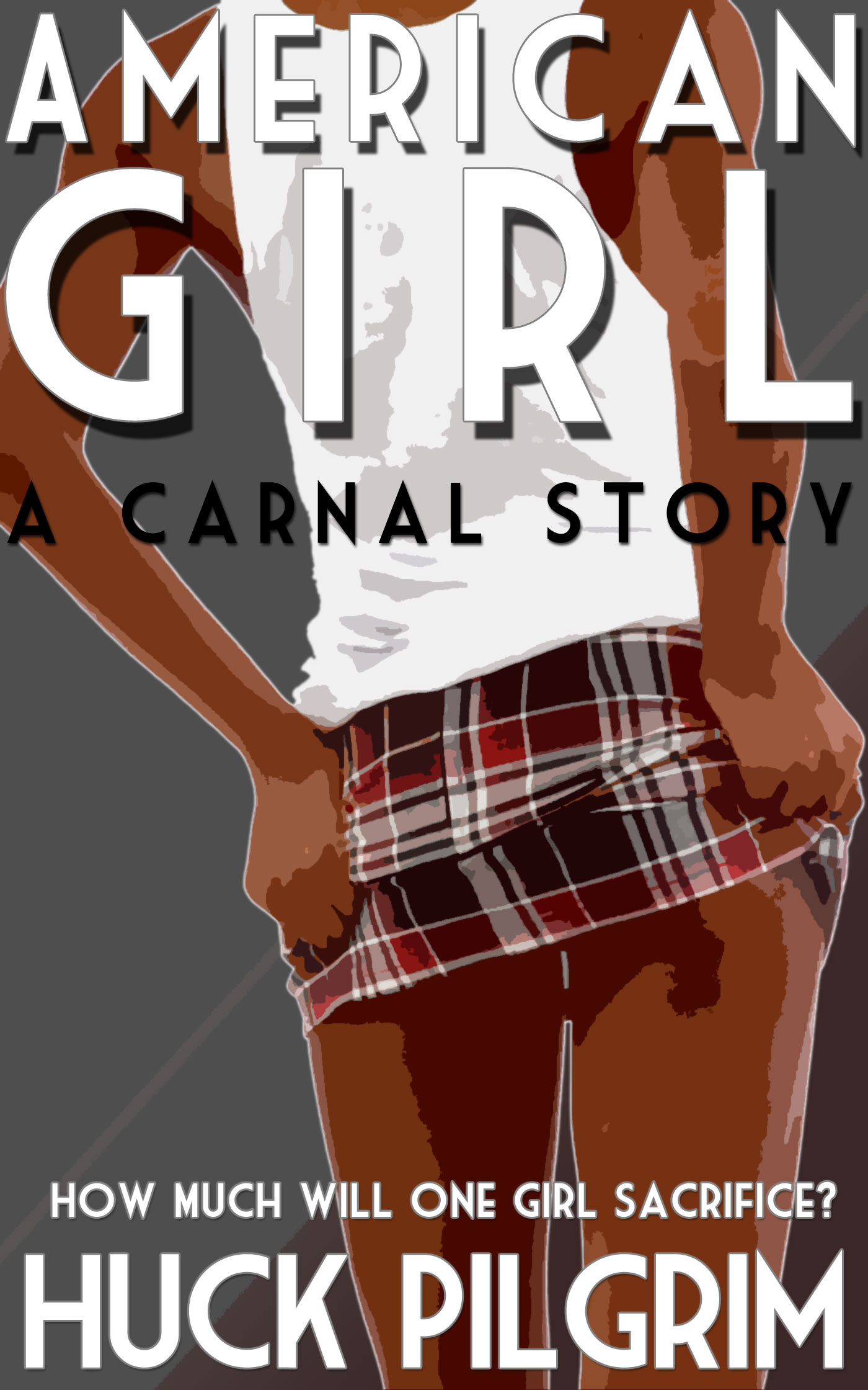
This is just a little test run to bring my Photoshop skills up to speed. On the top is the existing cover, below on the left is a potential revision, and on the right another new one. The comicbook filters give it a look that makes me think of the old pulp fiction covers. I love the idea of tag lines, so I added one to American Girl.
The only difference between the left one and the one on the right is a little more drop shadow on the title fonts. For some reason, it tricks your eye into seeing lighter outlines around the girl.
I like the one on the far right best.

What do you think? Am I going in the right direction?
